Analysing Print Ads
What makes a good print advert:
- Clear and effective image
- Memorable - emotional, informative
- Slogan/catch phrase/tagline - entice the target audience
- Persuasive language
- Clear language
- Appropriate font
- Colour scheme
- Clear layout
- Name of product
- Website
- Brand identity
- Eye catching
Red Bull: find your wings
- Persuasive language
- Clear imaging
- Eye catching background
- Red wings - dangerous/risk taking
- Logo on the back
- Wings are presented due to slogaN
- Wide angle shows the whole picture of risk taking
- Clear uncluttered layout
- Persuasive language
- Uses clear font
- Minimal writing (clear)
- Serif font
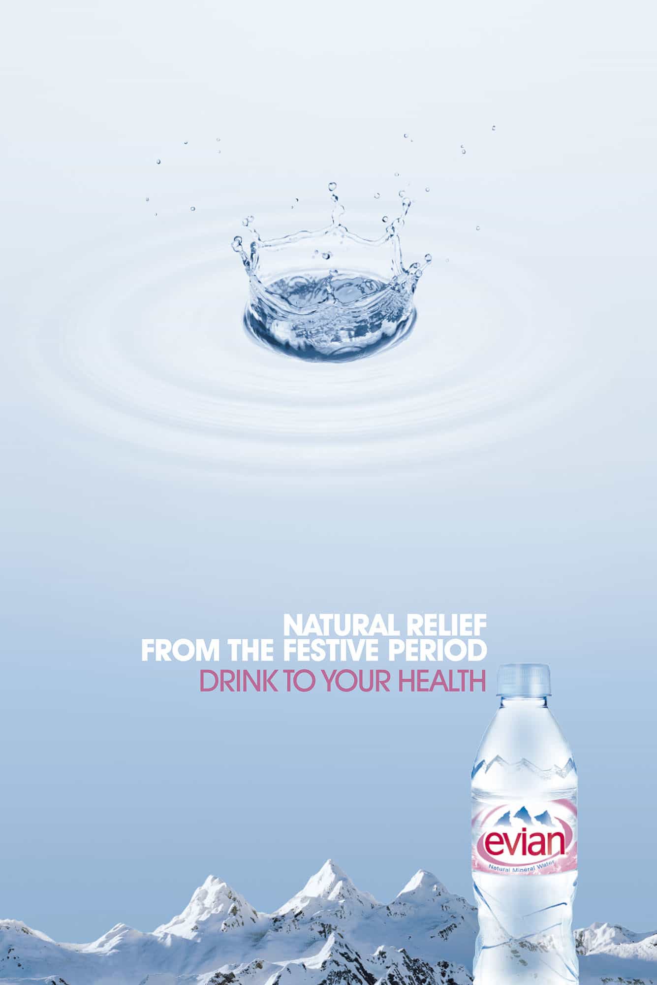
- Promoting the coldness
- DRINK TO YOUR HEALTH - Promoting healthy lifestyle
- Clear/uncluttered
- Blue colour scheme- uphold clear/ minimal coloured bottle
- Colour scheme match product
- Language is second person / persuasive
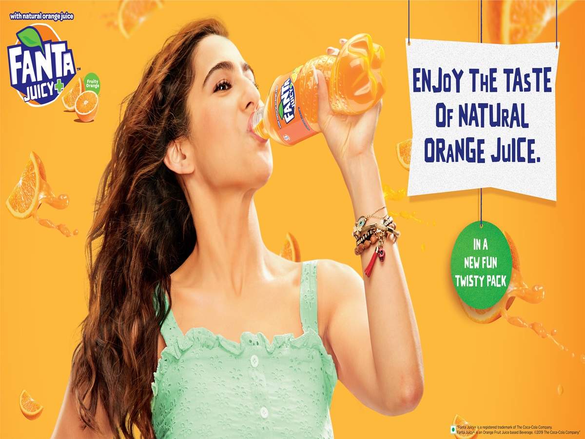
FANTA AD:
- Colours connoting the brand
- Natural orange juice ( persuasive)
- Logo on the side (catch attention of familiar brand)
- Clear and fun advertising
- Bright colour scheme -eye catching for audience
PEPSI AD:
- Bold slogan
- Serif font (clear and eye catching)
- Words in capitals for attention
- Colour scheme mirrored on the background
- Persuasive language
- Large picture of product (eye catching)


Comments
Post a Comment